How To Customize The Breakdance Grid Layout
By default, the Breakdance theme Grid element creates static grid layouts using a selected number of columns and rows that you specify. You can customize the default grid layout in creative ways...
By default, the Breakdance theme Grid element creates static grid layouts using a selected number of columns and rows that you specify.
The Grid element creates evenly spaced and sized grid blocks based on the contents of the largest block in a row. So row 2 will be taller to fit the contents of the 2nd column in row 2 if they are taller than any of the row 1 blocks.
Enough of that.
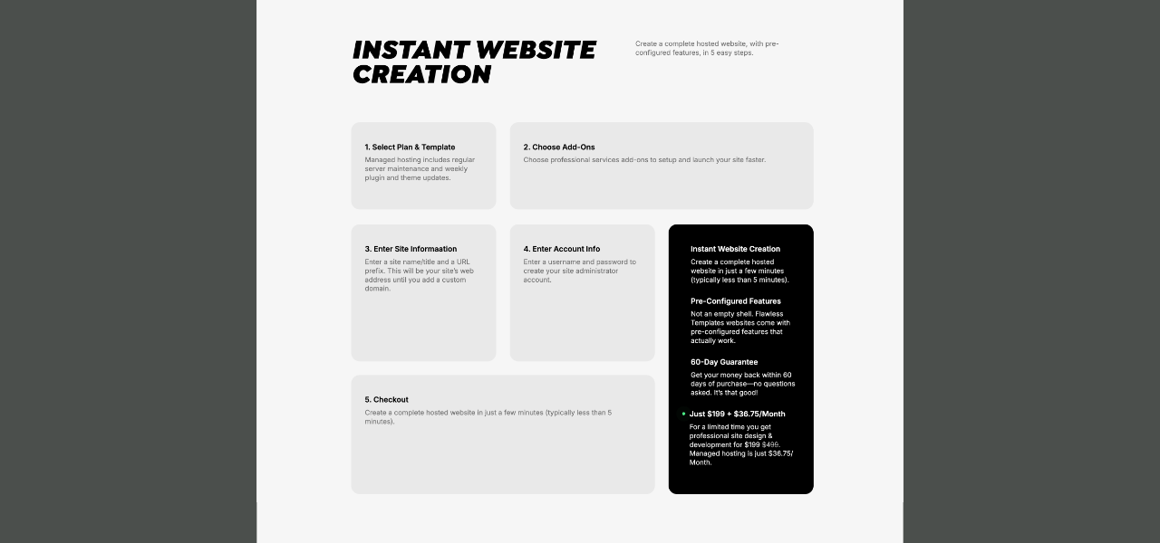
You can customize the default grid layout in creative ways. I used this method on the Flawless Templates website.
How to customize the Breakdance Grid
Part 1 Video: Make a custom Grid layout.
Part 2 Video: Make a 2-column layout for Tablet Portrait screen sizes.
Here’s how to customize the Breakdance theme Grid layout:
- Create a Grid in Breakdance (Example: 3 columns, 2 rows, 6 total blocks)
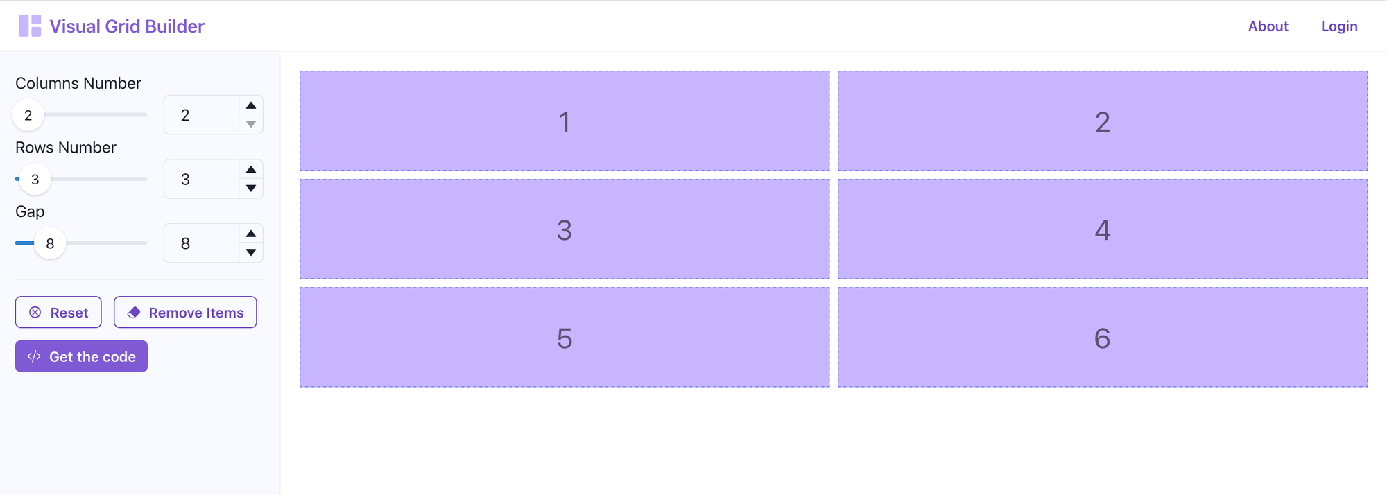
- Go to visualgridbuilder.com
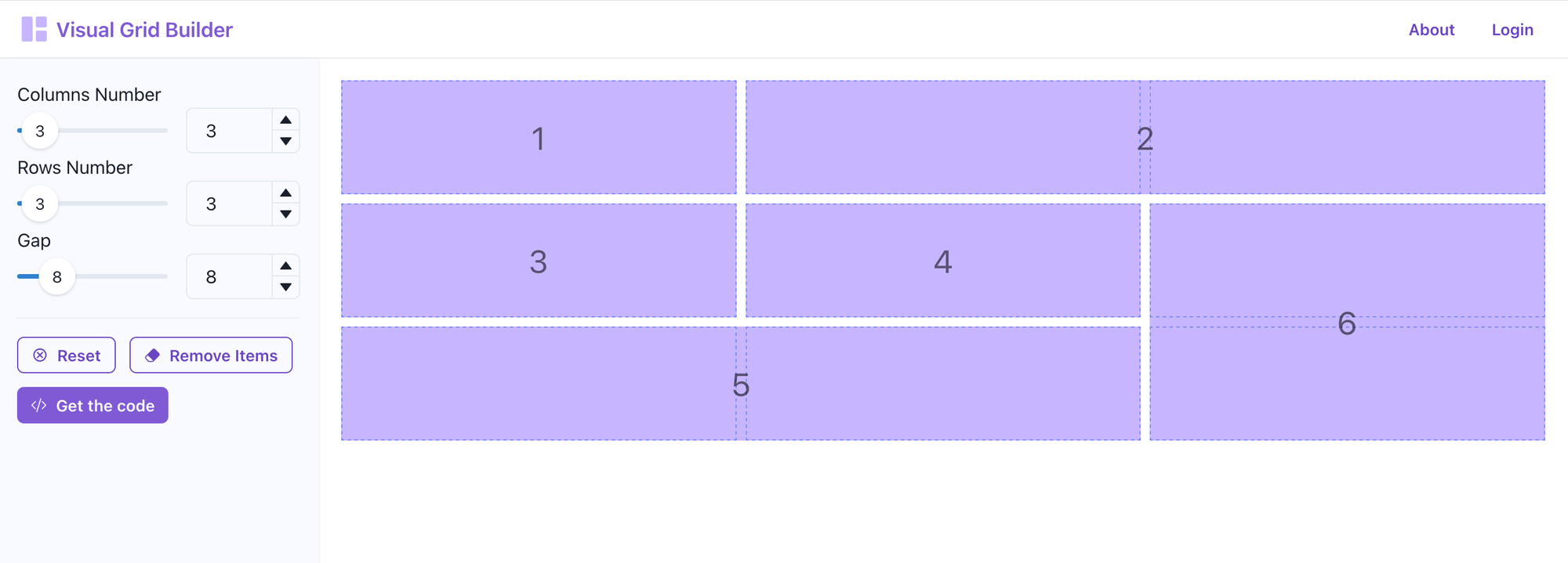
- Create the grid layout you want (Example: 3 columns, 3 rows, 6 total blocks)
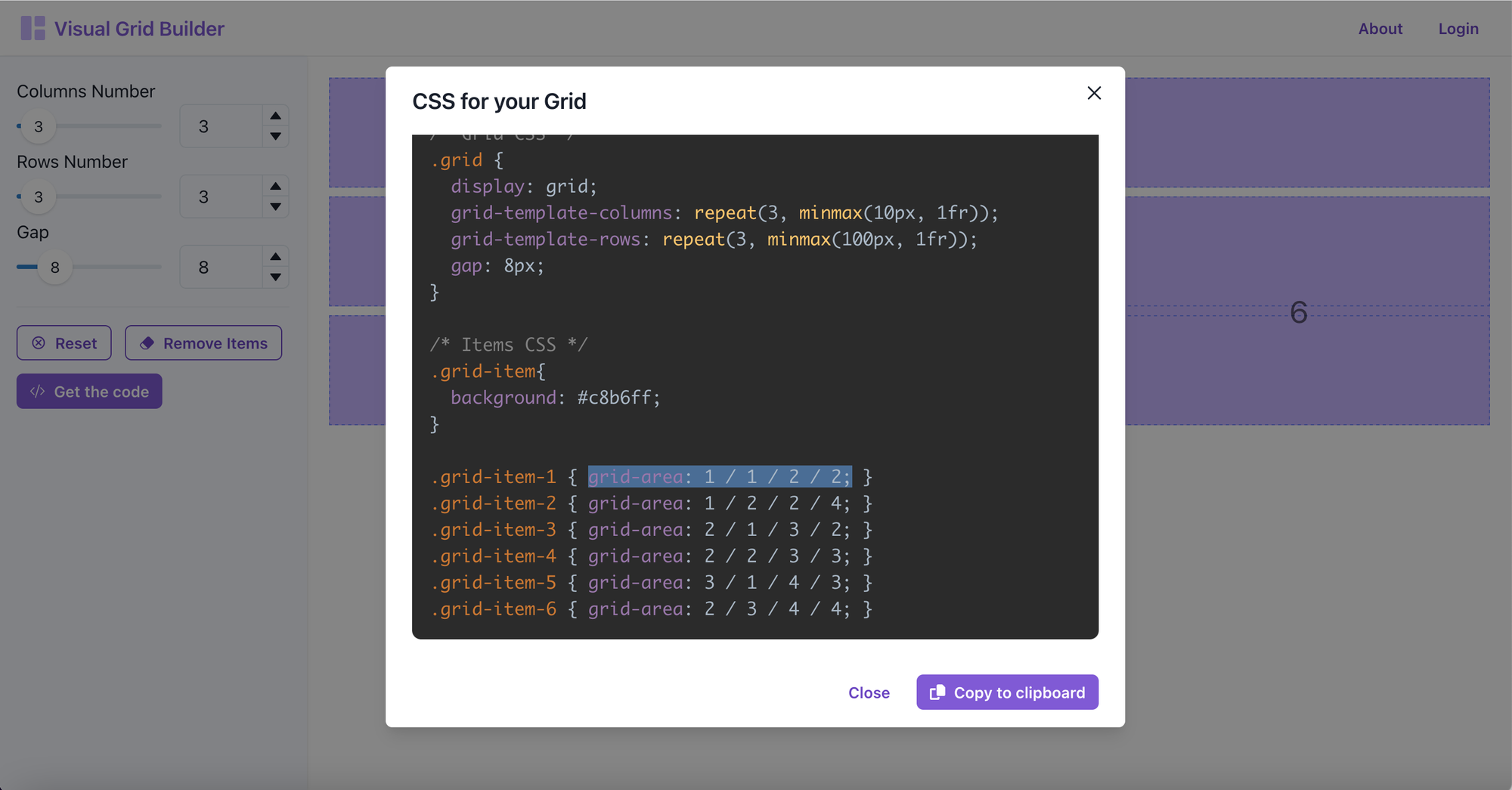
- Click the Get the code button to open the "CSS for your Grid" panel
- Scroll down to the Grid Items code - Example: .grid-item-1 { grid-area: 1 / 1 / 2 / 2; }
- Copy the code inside the brackets for the first item - Example: grid-area: 1 / 1 / 2 / 2;
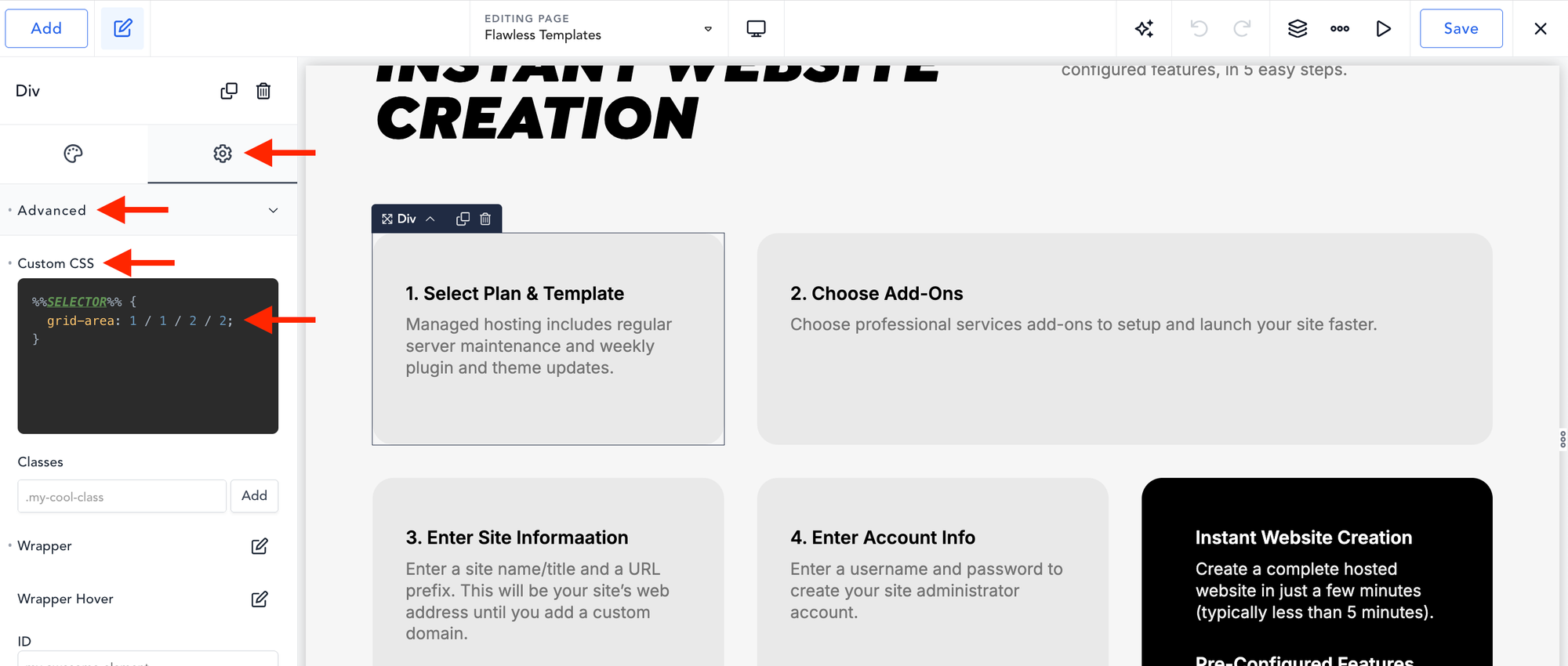
- Go to the Breakdance editor, click the first grid item... (Div)
- Click the Gear Icon (Settings) (Left-Sidebar)
- Click the Advanced tab
- Paste the copied code into the Custom CSS pane
- Click the Save button (Top-Right)
- Repeat for all other items in your grid.
Follow these steps to make your Grid transform to a 2-Column layout on Tablet portrait screen sizes. (Note: The Grid will automagically shift to a 1-Column layout for smaller screens.)
- Create a 2-Colum and 3-Row layout on visualgridbuilder.com (2-columns, 3 rows, 6 total blocks)
- Click the Get the code button to open the "CSS for your Grid" panel
- Scroll down to the Grid Items code - Example: .grid-item-1 { grid-area: 1 / 1 / 2 / 2; }
- Copy the code inside the brackets for the first item - Example: grid-area: 1 / 1 / 2 / 2;
- Go to the Breakdance editor, click the first grid item... (Div)
- Click the Gear Icon (Settings) (Left-Sidebar)
- Click the Advanced tab
- Paste the copied code into the Custom CSS pane
- Click the Save button (Top-Right)
- Repeat for all other items in your grid.
That’s it.
You’ve created a gorgeous responsive custom grid layout using the Breakdance Grid Element. (Like the one I made above.)
Enjoy!