By default, the Breakdance theme Grid element creates static grid layouts using a selected number of columns and rows that you specify.
The Grid element creates evenly spaced and sized grid blocks based on the contents of the largest block in a row. So row 2 will be taller to fit the contents of the 2nd column in row 2 if they are taller than any of the row 1 blocks.
Enough of that.
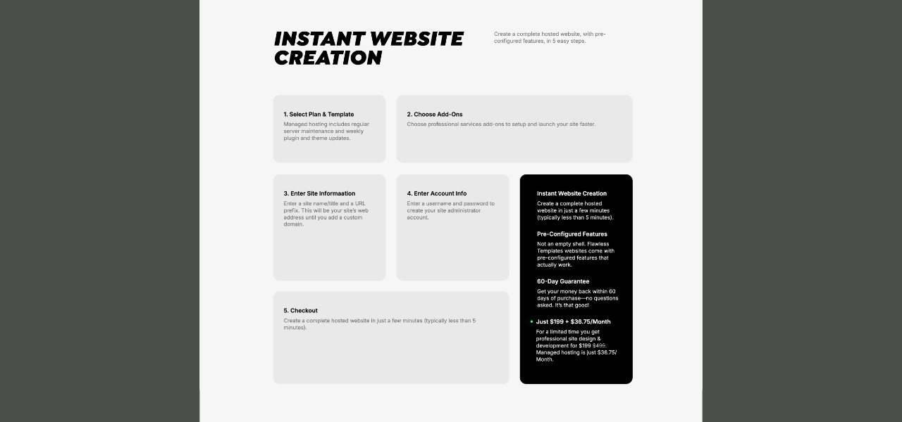
You can customize the default grid layout in creative ways. I used this method on the Flawless Templates website.
How to customize the Breakdance Grid
Part 1 Video: Make a custom Grid layout.
Part 2 Video: Make a 2-column layout for Tablet Portrait screen sizes.
Here’s how to customize the Breakdance theme Grid layout:
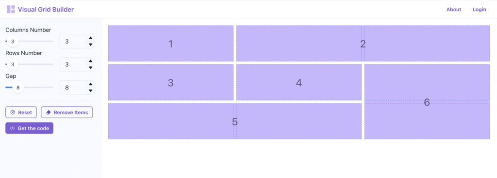
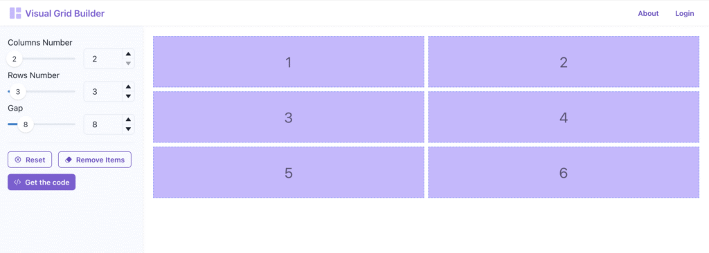
Create a Grid in Breakdance (Example: 3 columns, 2 rows, 6 total blocks)
Create the grid layout you want (Example: 3 columns, 3 rows, 6 total blocks)
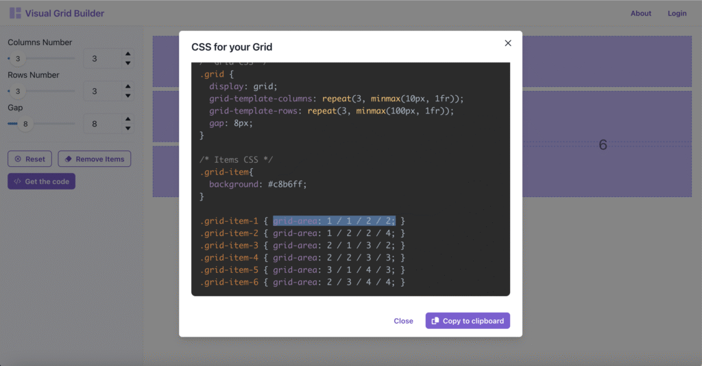
Click the Get the code button to open the “CSS for your Grid” panel
Scroll down to the Grid Items code – Example: .grid-item-1 { grid-area: 1 / 1 / 2 / 2; }
Copy the code inside the brackets for the first item – Example: grid-area: 1 / 1 / 2 / 2;
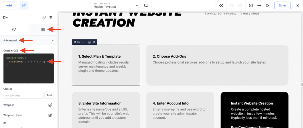
Go to the Breakdance editor, click the first grid item… (Div)
Click the Gear Icon (Settings) (Left-Sidebar)
Click the Advanced tab
Paste the copied code into the Custom CSS pane
Click the Save button (Top-Right)
Repeat for all other items in your grid.
Follow these steps to make your Grid transform to a 2-Column layout on Tablet portrait screen sizes. (Note: The Grid will automagically shift to a 1-Column layout for smaller screens.)
Create a 2-Colum and 3-Row layout on visualgridbuilder.com (2-columns, 3 rows, 6 total blocks)
Click the Get the code button to open the “CSS for your Grid” panel
Scroll down to the Grid Items code – Example: .grid-item-1 { grid-area: 1 / 1 / 2 / 2; }
Copy the code inside the brackets for the first item – Example: grid-area: 1 / 1 / 2 / 2;
Go to the Breakdance editor, click the first grid item… (Div)
Click the Gear Icon (Settings) (Left-Sidebar)
Click the Advanced tab
Paste the copied code into the Custom CSS pane
Click the Save button (Top-Right)
Repeat for all other items in your grid.
That’s it.
You’ve created a gorgeous responsive custom grid layout using the Breakdance Grid Element. (Like the one I made above.)
Phillip Crawford says:
Thank you for the clear roadmap — it makes the process less intimidating.